Customise Feed: I hid Shorts, side recommendations, and the homepage. Here's what YouTube looks like underneath.

The default YouTube interface is an argument
Every element of the standard YouTube layout is making a case for your attention. The homepage is a grid of recommendations optimised to generate clicks. The sidebar on any video page is a ranked list of what the algorithm wants to show you next. Shorts appear in their own shelf, set apart with their own visual language, asking for a different mode of engagement.
None of this is neutral design. It is an interface built to maximise the surface area of algorithmic suggestion. The content you came for is present, but it is surrounded by a large amount of material you didn't ask for and didn't choose.
The Customise Feed controls in Gazenest are the structural response to that. Rather than tracking how you respond to the algorithm, they let you modify what the algorithm can surface.
What hiding Shorts actually does
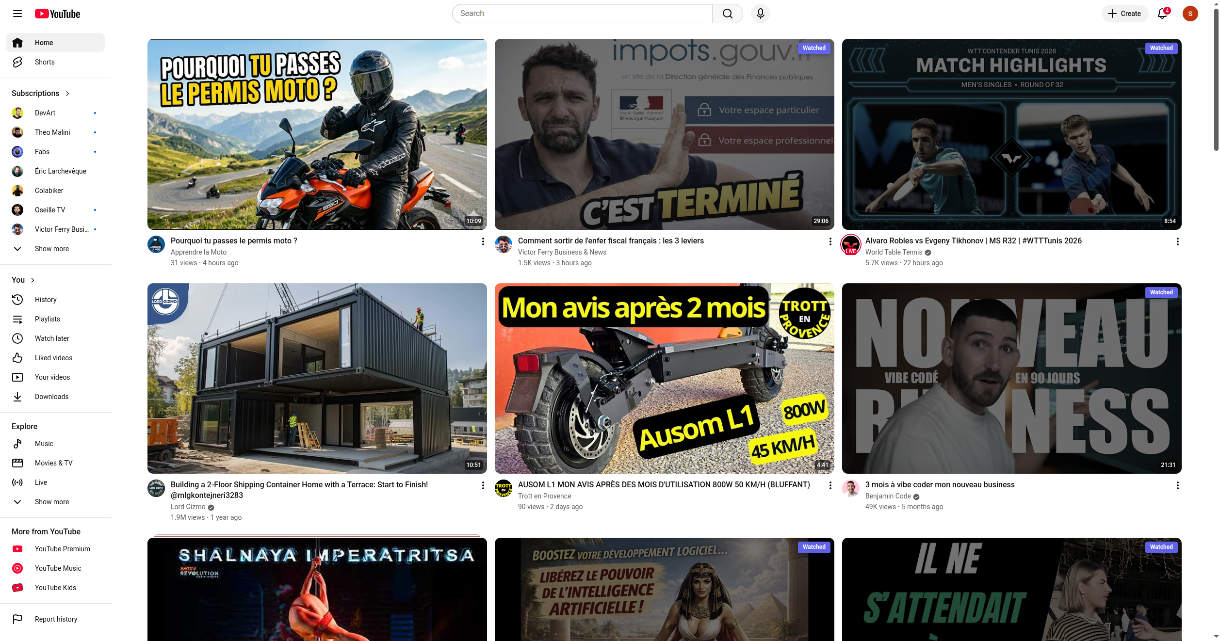
When you hide Shorts from your feed, two things happen. The Shorts shelf disappears from the homepage. Shorts stop appearing in the sidebar on video pages. The content is still accessible, you can navigate to the Shorts tab on a channel, and the search works normally, but it is no longer inserted into your browsing flow automatically.
I've been hiding Shorts for several months. The change is harder to articulate than I expected. The interface becomes calmer. There is less competing visual motion. Shorts thumbnails have a particular visual grammar, vertical format, high-contrast text overlays, expressive thumbnails, that was creating a low-level sense of busyness every time I opened the homepage. Without them, the page reads more cleanly.
The more substantive effect is on session structure. Shorts are designed for a different attention mode than long-form content, faster, more reactive, easier to keep going indefinitely. When they're removed from the browsing flow, that mode isn't triggered. Sessions that might have drifted into a Shorts queue stay in the kind of watching I came for.
Removing YouTube recommendations from the sidebar
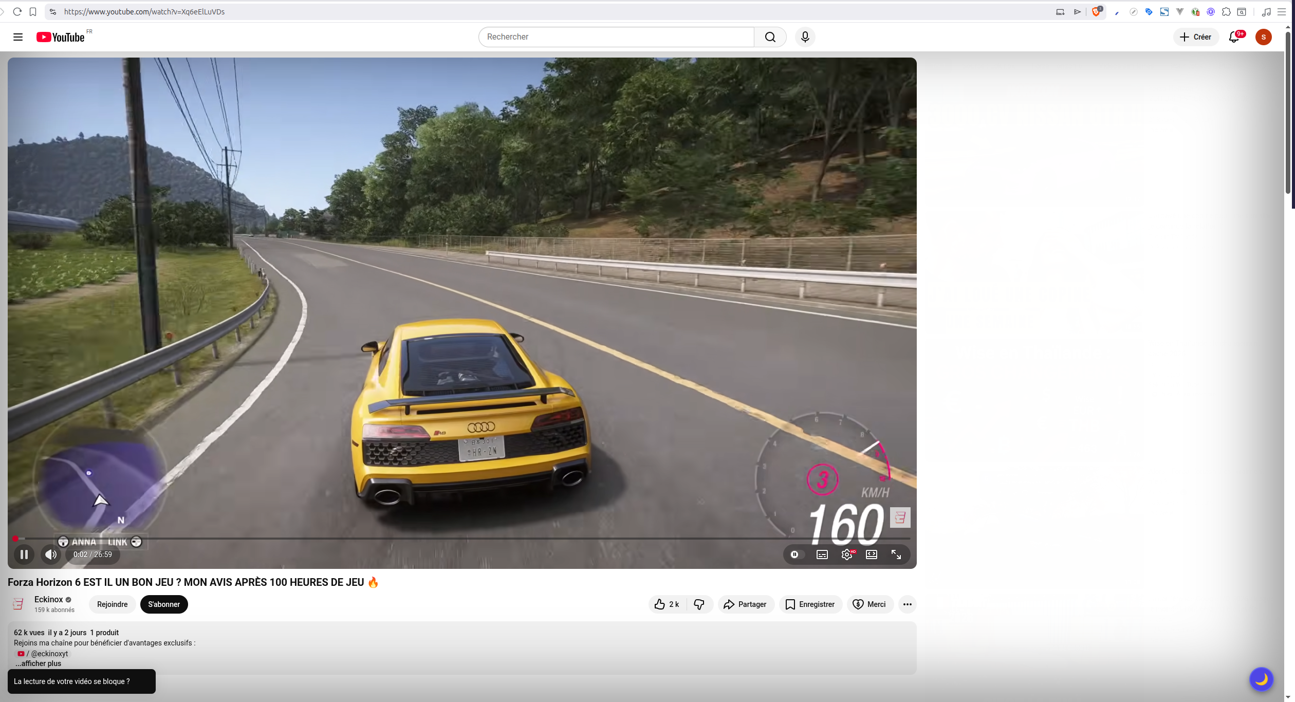
The side recommendations panel on a video page is, in my view, the single most effective drift mechanism in the YouTube interface. You are watching something you chose. To your right is a ranked list of things the algorithm thinks you'll click next. The moment a video ends, the closest recommendation is already on screen, one click away.
Hiding the sidebar removes that list. The video ends and the page becomes quiet. The next action is yours to initiate.
I expected this to feel like something was missing. In practice, it felt like pressure had been removed. Without the sidebar, I noticed I was making genuine decisions about what to watch next, going back to my subscription feed, or searching, rather than defaulting to whatever was in front of me.
What the homepage looks like underneath
This one is more drastic and worth considering carefully. When you hide the homepage, YouTube's landing page becomes the subscription feed. You see new videos from channels you've explicitly subscribed to, in reverse chronological order.
The change in experience is significant. The homepage is where algorithmic exploration happens. If you're using YouTube primarily to follow creators you've already chosen, hiding the homepage may be a net improvement. If you're using it to discover new content, you'll want to keep it available and use the subscription feed selectively.
For me, the combination that works best is: Shorts hidden, sidebar hidden, homepage visible but with the watched-videos filter active. The homepage becomes a smaller, less repetitive surface. The sidebar is gone. The Shorts shelf is gone. What remains is recognisably YouTube but structured around choices rather than algorithmic suggestion.
The difference between filtering and awareness
Most screen-time interventions work on the awareness layer. They tell you how much time you've spent, surface patterns you didn't notice, prompt you to reflect. That layer is valuable. I've built several of those tools in Gazenest.
The Customise Feed controls work differently. They change the choice environment before you make decisions, rather than reporting on decisions after the fact. The awareness layer tells you what happened. The structural controls change what's available to happen.
The argument for structural interventions is that awareness alone is hard to act on consistently. Knowing that Shorts tend to send me into low-clarity sessions is useful information, but in the moment, when I'm tired and a Shorts shelf is right there, the information and the reflex are competing on unequal terms. Removing the shelf resolves that competition before it starts.
The honest version of this
These controls are not magic. Hiding Shorts does not make you a more intentional YouTube user by itself. The underlying patterns that lead to drift are still present, the algorithm is still there, the recommendations still exist, and boredom still looks for an outlet.
What the controls do is remove specific structural triggers. They make the path of least resistance slightly less direct. In my experience, that margin is enough to change what happens at the edges of sessions, the moments when a video ends and you haven't quite decided what to do next.
Those are the moments that add up.
Try the Customise Feed controls, available on Gazenest Pro.
Ready to understand your YouTube habits?
Install the Gazenest extension and start watching with intention.
Install GazenestLast updated: 12 June 2026